Spotify App Redesign
Spotify is the most popular music streaming platform in the world, offering a wide selection of music, podcasts, audiobooks, and videos. This case study was aimed towards identifying users’ struggles and preferences in their use of the mobile app and implementing new designs and features to tailor and enhance Spotify’s holistic experience to those wants and needs.
Duration
Sept. 2023 - Dec. 2023 (11 weeks)
Role
UX DesignerTeam
Angela (project lead), Jade, Samantha, Sarah Tools
Figma, Figjam01
Context
The Problem
Despite connecting its users to millions of songs and podcasts, the Spotify mobile app falls short in delivering personalized recommendations. They also fail to integrate existing social features, diminishing the overall user experience.
How do current Spotify mobile users interact with key features and what challenges do they face?
How might we enhance personalized music recommendations while elevating and integrating the missing social aspects of Spotify into the mobile version to create a more engaging user experience?
Guiding Questions
The Outcome
A redesign of each major area of the app that offers solutions by:
Aligning the complete Spotify experience by bridging the gap between mobile and desktop features
Reorganizing content to create more hierarchy and diversifying recommendation methods
Increasing the presence of customizable social features to fit any level of preferred privacy
The Process
02
Research
Competitive Analysis
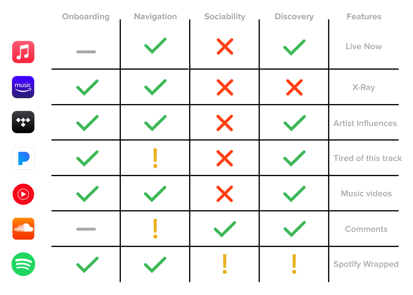
Spotify has a unique edge over competitors with the sociability of their platform.We looked further into a few other music streaming platforms—Apple Music, Amazon Music, Tidal, Pandora, YouTube Music, and SoundCloud. We compared our own experiences and observations on each app, identifying UI and UX decisions that we enjoyed, disliked, found interesting, and had questions about. We gained an idea of each platform’s strengths and weaknesses and saw what made each one unique.
An aspect that we noticed was missing in the majority of platforms was the sociability. They mainly focus on the music streaming experience of the individual user, but music as a shared experience is not seen as a priority for most of Spotify’s competitors.
User Interviews
Most respondents use Spotify due to Brand loyalty, its popularity, and the unique social features.We conducted 12 interviews with current Spotify users with questions regarding their choice and use of Spotify in comparison to competitors, their experiences with music discovery, and the social aspects of the app.
From these interviews, we narrowed down our focus to 3 user insights.
People find Spotify’s music recommendations to be inconsistent and hit-or-miss, resulting in them gravitating to their own playlists over Spotify’s recommended playlists.
While the social aspect of Spotify may not rank as the highest priority for users, the social aspect and their features are still valued and appreciated.
People seek a uniform and consistent experience between the mobile app and desktop version, primarily in the form of feature parity.
03
Ideation
User Personas & Journeys
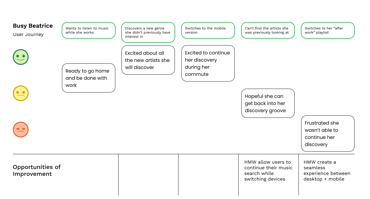
Understanding Target Users BetterBased on the insights we gathered from user interviews and our observations in the competitive analysis, our team created user personas and journeys that reflected the experience of a real user and addressed the various issues we identified.
I personally built Niche Nancy for someone that needs a wider variety of recommendations to enhance her discovery of new music. Other personas developed focus on other aspects of the insights.
Information Architecture
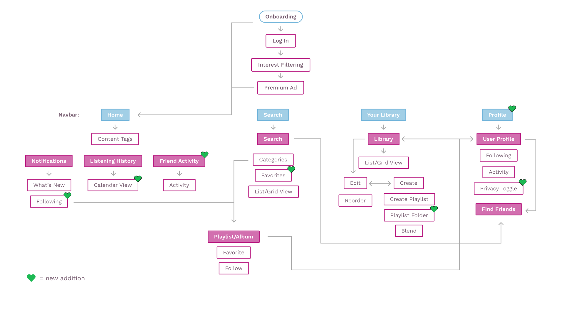
Restructuring and Adding FeaturesWe kept the current organization of the app, but we added a new profile tab to the navigation bar to address pain points regarding difficulty accessing the profile easily as well as our insight related to the social aspect of Spotify.
This information architecture guided our designs throughout the rest of the case study.
Sketches
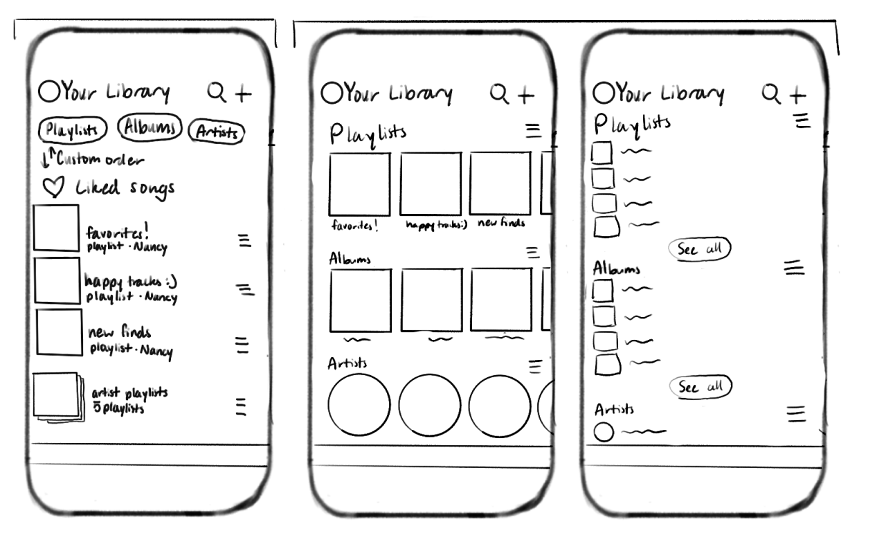
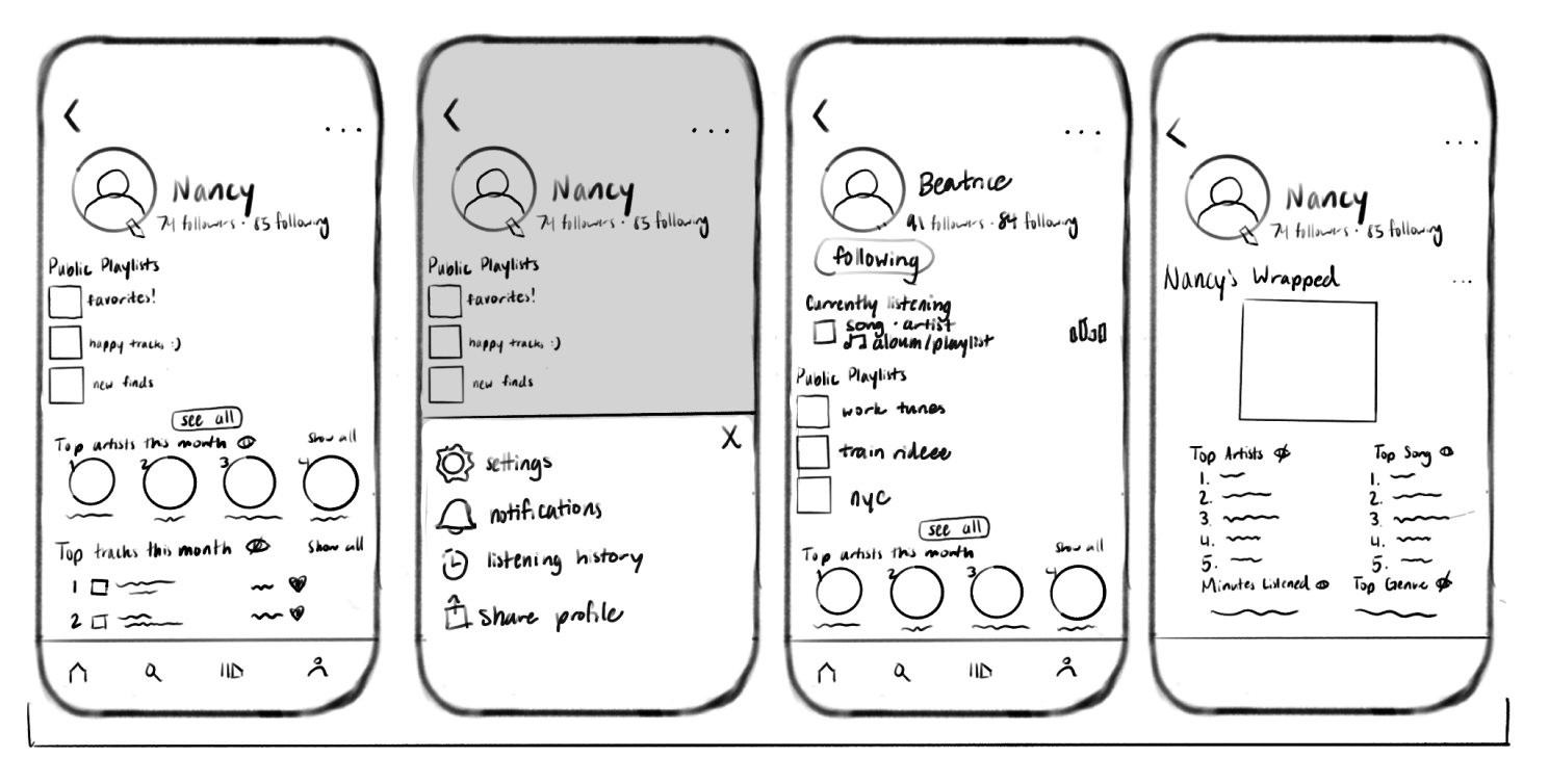
Drafting the Basic ConceptsEach of us took two parts of the navigation bar and drew a few ideas of what we envisioned for the redesign. We then discussed our thought process for our sketches, chose what key features and visuals that were best fit for our goals from each sketch, and decided on what we collectively wanted to include in the later design stages.
I sketched ideas for the Spotify library and profile featuring list and grid view options, sorting, expanded social features, and privacy settings to address the inconsistencies between mobile and desktop and leverage the unique social and data analysis features.
Home
Search
Library
Profile
04
Design
Low-Fidelity Wireframing
Visualizing the Flow and FeaturesWith our finished sketches, we started making our low-fidelity wireframes to properly visualize the app’s new design and figure out how our ideas would function. We designed basic screens for the new navigation tabs as well as Spotify’s onboarding.
I focused on redesigning the library, however our team brainstormed ideas together and provided feedback through critiques at our regular meetings.
Onboarding
More context and organization
Home
Tailored content and increased presence of the social aspects of Spotify
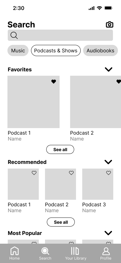
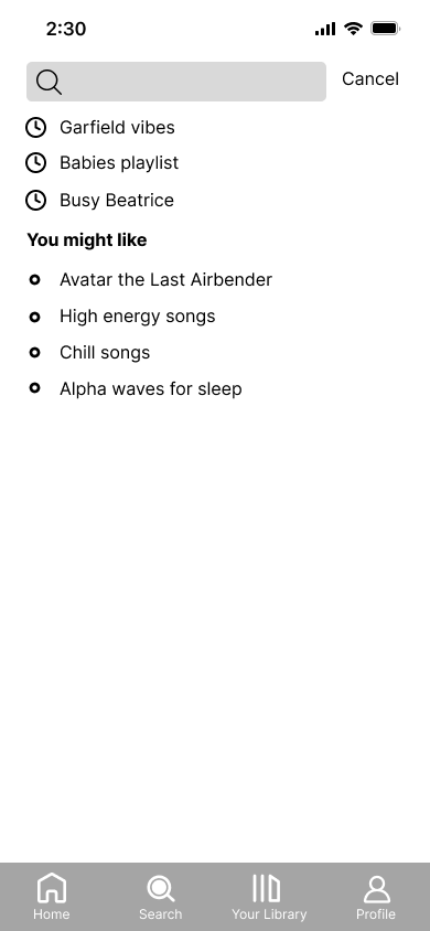
Search
More hierarchy and variety of content in categories
Library
Immediate organization and added desktop features
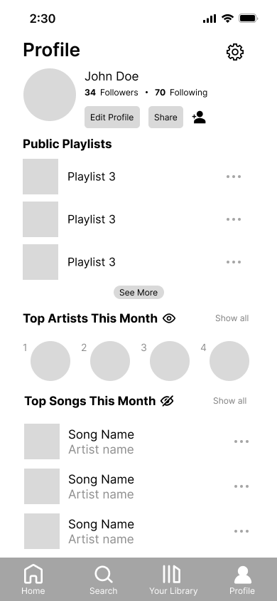
Profile
Privacy toggles and in depth user information
Iterate
A Round of User Testing to Receive FeedbackBefore moving into high-fidelity designs, we prototyped the basic functions of our wireframes and conducted a round of user testing with 8 users. We found parts of our designs that users liked such as the new profile tab and better hierarchy throughout. We also found what users struggled with like close touch targets, confusing icons, and difficulties finding certain features.
This round of testing helped us make more intentional changes when making our final designs, especially with decisions that we were unsure about in the wireframing stage.
High-Fidelity Prototypes
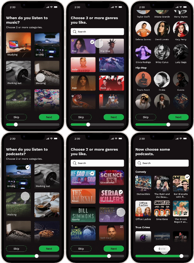
Podcasts are shown as an optional part of the onboarding. Users that listen to podcasts would go through a similar but shortened process as the music section of the onboarding for their podcast interests. Users that don’t listen to podcasts may easily skip this section entirely.
Genres are now implemented into onboarding which helps organize the artists a user can choose as well.
When a user chooses an artist, related artists appear.
Users may skip any part of the onboarding.
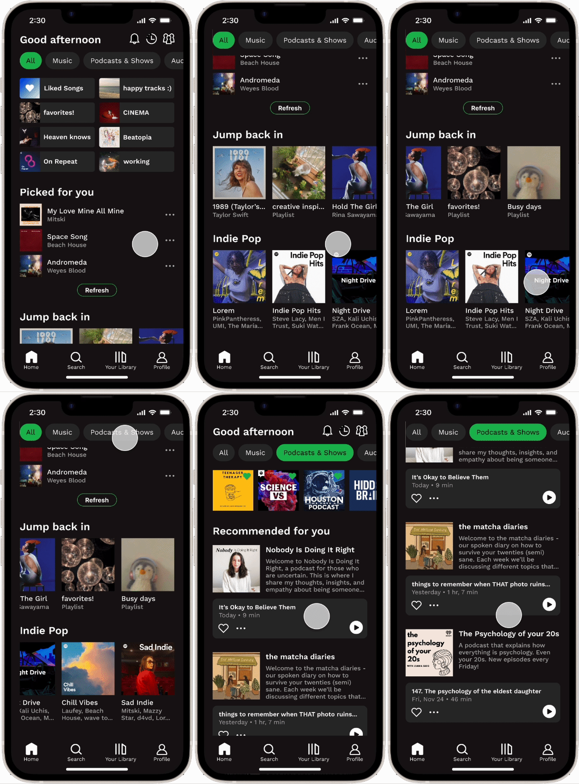
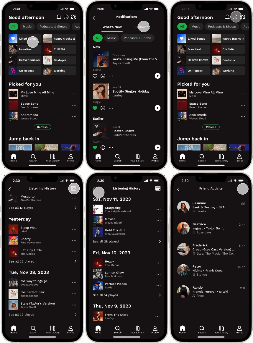
The Home page now has more tailored recommendations and easy access to more relevant content to the user.
The podcasts were also reorganized to provide more information on an entire podcast rather than only one episode while maintaining the ability to start listening to an episode immediately.
Notifications include social interactions with a user’s profile.
Users can choose a specific date to go back to in the listening history.
Friend activity, previously exclusive to desktop, is accessible to mobile users.
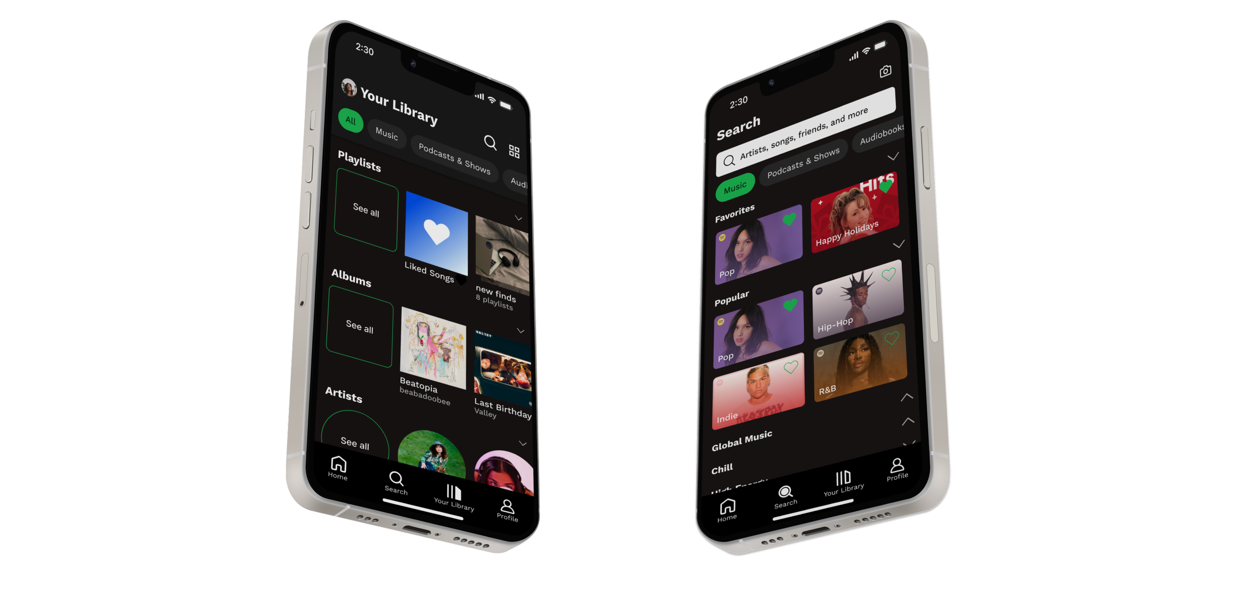
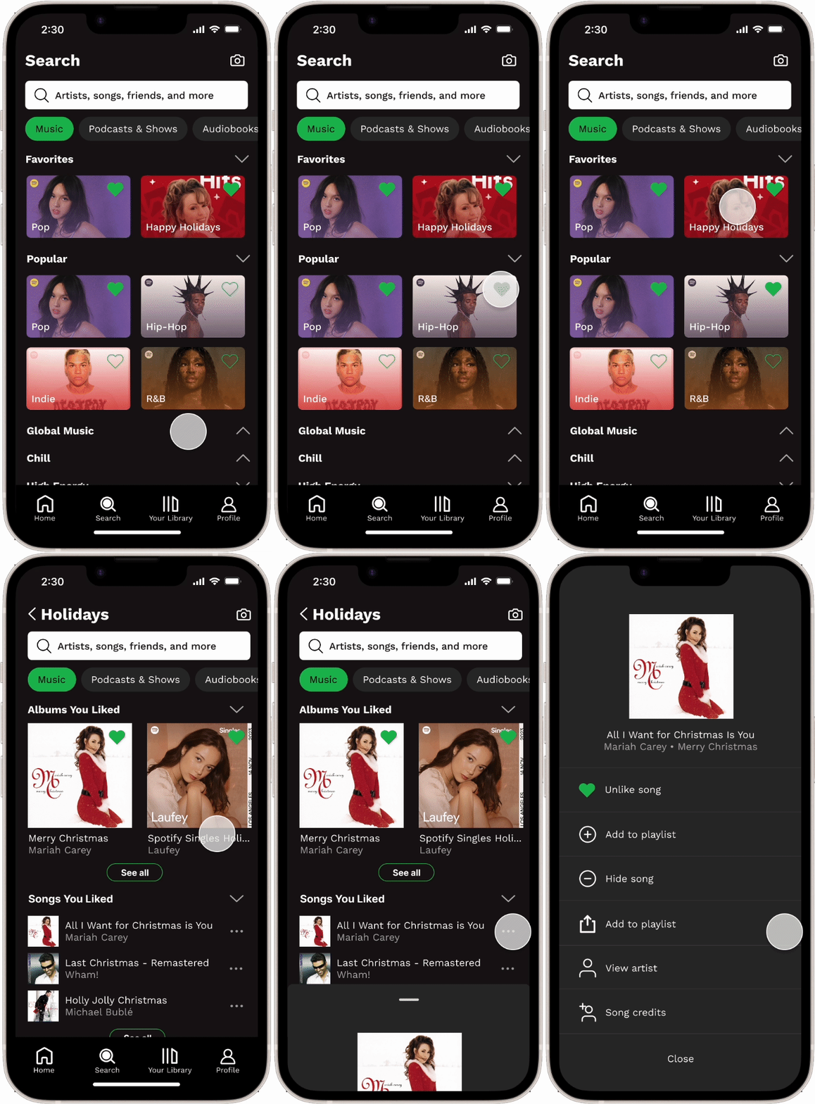
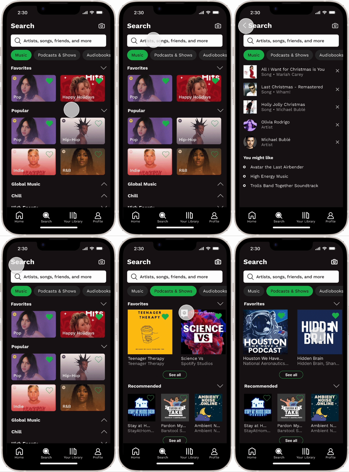
The Search page cards have been redesigned to highlight the album covers more while maintaining Spotify’s UI style with the gradient effect.
There’s added hierarchy within the categories as well as the ability to toggle to hide them.
Users are able to favorite categories for easier access in the future. The categories also display a larger variety of content than just Spotify’s playlists. These allow for a more personalized experience on the Search page.
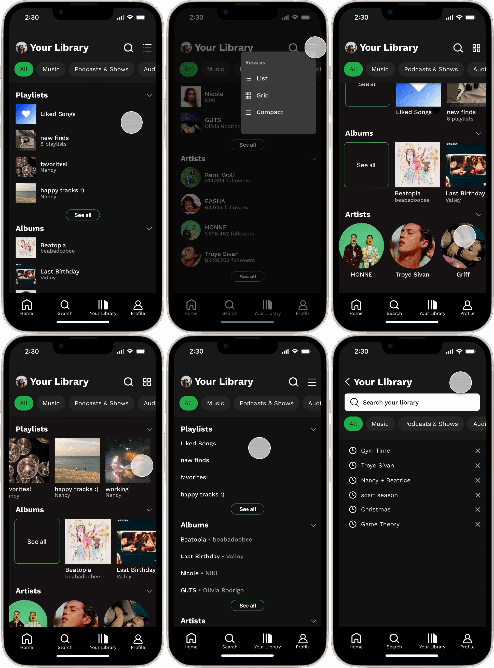
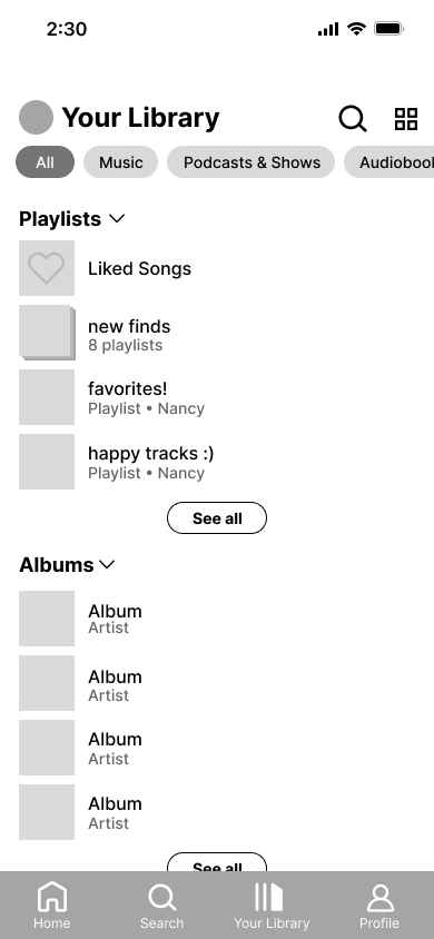
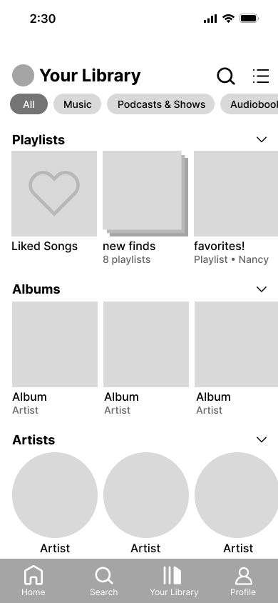
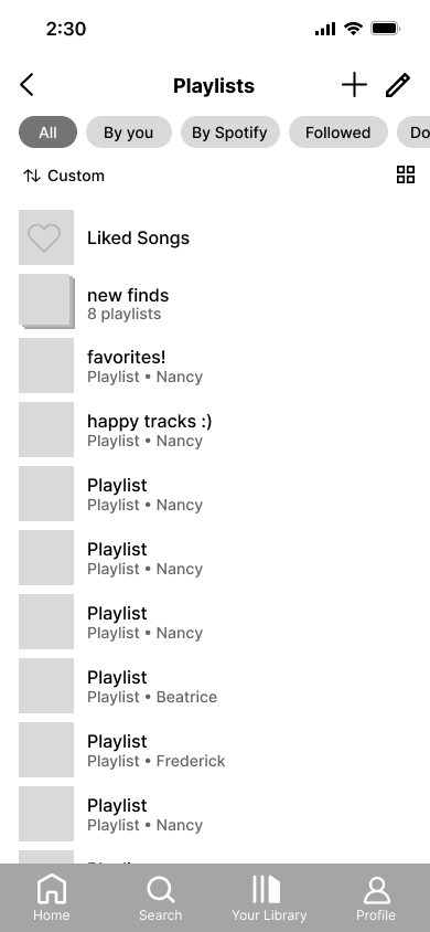
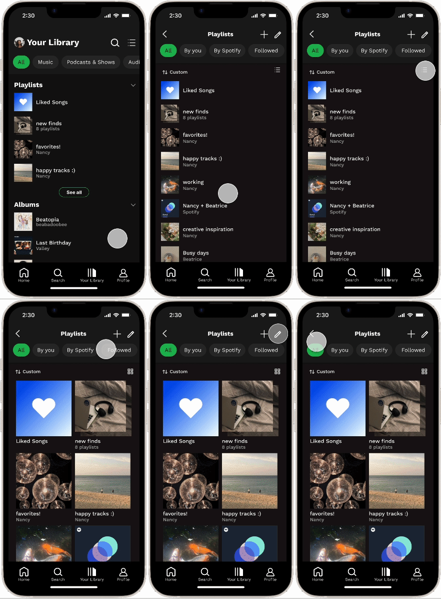
To avoid being overwhelmed on the main library page, especially for users with a lot saved in their library, only the top 4-5 of each category is displayed with the option to see all content on a separate page.
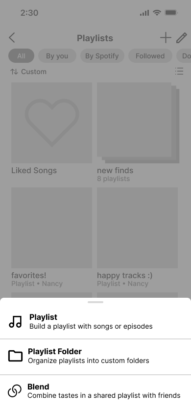
Here, users can reorder content, sort, change the view, and create/add new content.
To bridge the gap between the desktop and mobile view, we added a compact view that omits visuals and only shows basic information.
We added more organization by separating the content on the landing page by type and used more general filter tags.
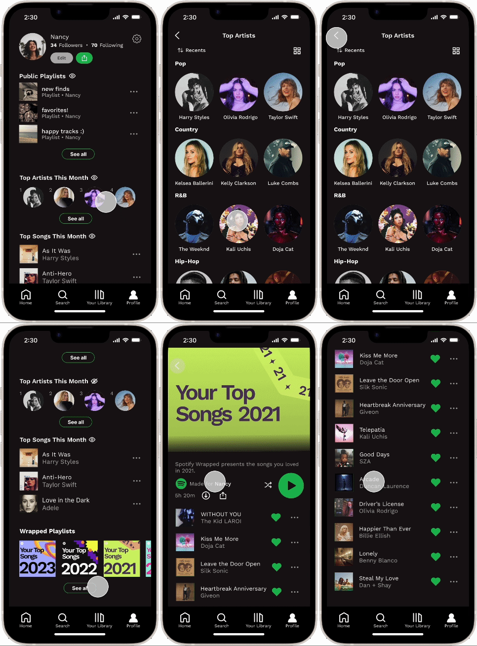
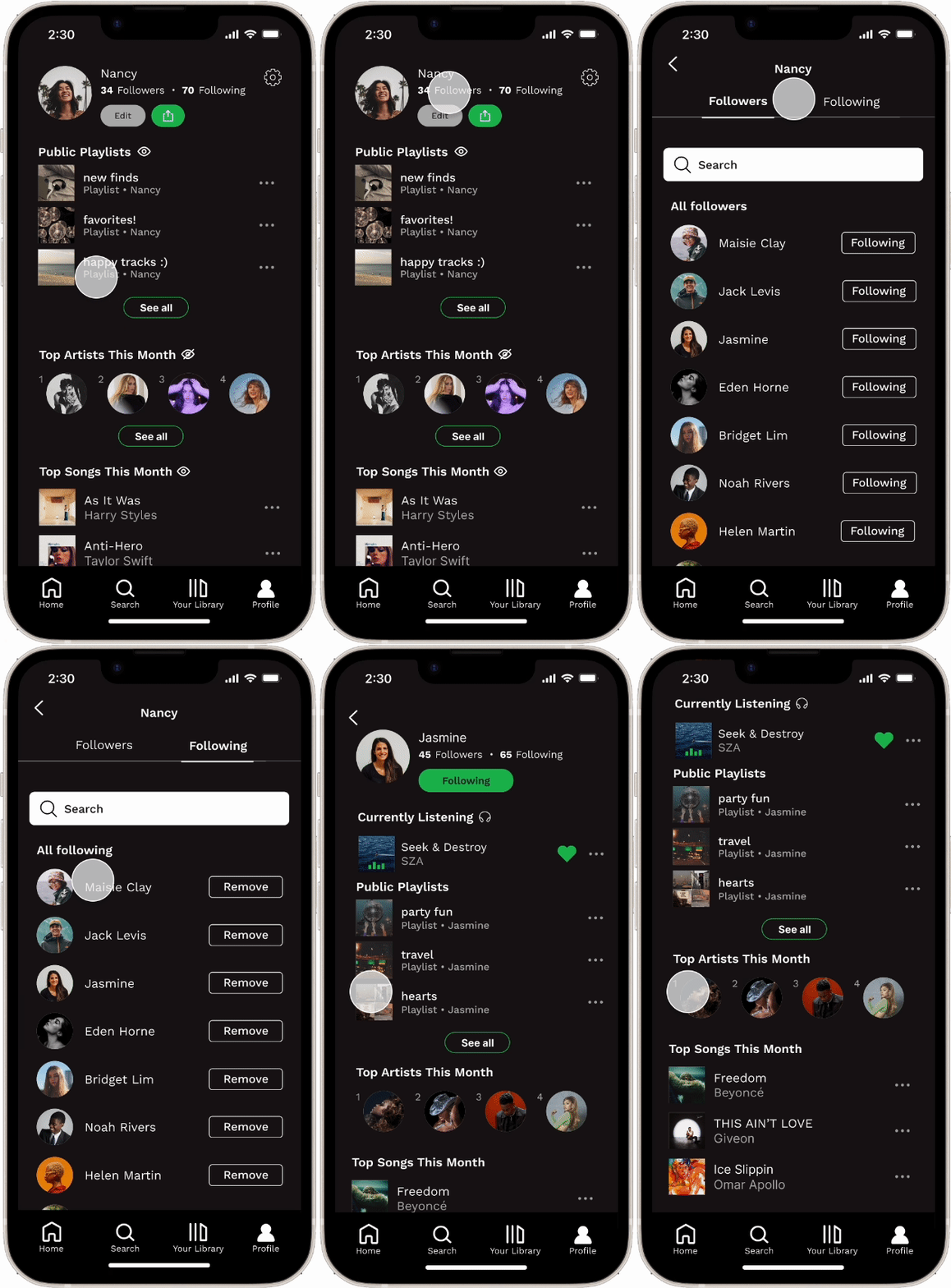
Profiles show more information similar to the desktop version with new privacy toggles to easily show or hide this information publicly.
Since Wrapped is a greatly valued aspect of Spotify, there is also a consolidated place for Wrapped on the profile.
The process of removing followers is more streamlined.
Current listening activity is displayed on a user’s profile to their friends.
05
Next Steps & Reflection
Next Steps
Further Testing our High-Fidelity Prototypes to Consider More Input on ChangesThough we performed user testing prior to making our high-fidelity designs, we did not get to perform more in depth testing with our final prototypes. Given more time, I would’ve liked to test the effectiveness of the changes we made after the first round of testing, possibly weighing in new options or ideas that may arise.
Reflection
Balancing Different Opinions Throughout the process, I often asked for opinions on my designs from my team and people outside of the project when I was stuck deciding between different ideas. At times, I struggled trying to balance different input on new features and visuals, but I learned to prioritize design choices that furthered the overall project’s main goals. I steered my mindset to connect the smaller details to the bigger picture of the entire project. Ultimately, the process of handling feedback improved the end result because I was more intentional with my approach and how it connected to the users’ wants and needs.

