Netflix App Redesign
Netflix is a global leader in entertainment services with a variety of on-demand content offered on TV, desktop, and mobile. This case study was aimed towards understanding the use of the mobile platform better and exploring ways to improve the overall experience on the app.
Duration
Feb. 2023 - Apr. 2023 (11 weeks)
Role
UX DesignerTeam
Sara (project lead), Maddie, Emily Tools
Figma, Figjam01
Context
The Problem
Netflix lacks a structure that enables users to find content relevant to their personal preferences in its vast collection of TV shows and movies.
Guiding Questions
How do users currently discover and select content?
What difficulties do they face in finding content that matches their preferences?
The Outcome
A redesign that offers solutions by:
Creating more methods of discovery and improving the organization and personalization options of existing ones
Providing users the ability to organize their saved content into customizable lists
Implementing user-to-user interaction through profiles and collaborative viewing
The Process
02
Research
Competitive Analysis
Observing Other Streaming Platforms to Compare the ExperienceWe looked further into a few of Netflix’s competitors—Peacock, HBO, Hulu, and Amazon Prime Video. From comparing the experience on each app from the type of content, organization, and features, we gained a better understanding of streaming services in general. While each platform offered similar services and content, we found that they all differentiated their experiences in their own ways.
User Interviews
Users gravitate to Netflix for the content it offers, so we aim to make relevant content more accessible.We conducted 12 interviews with users categorized into occasional, casual, and intense viewers to learn more about their preferred choices of streaming services as well as their use cases and struggles.
From these interviews, we narrowed down our focus to 5 user insights.
Discovery
The home page is inconsistent and the most important categories are lost in too much content.
Users discover new content through methods not supported with in the app, like through social media.
Organizing Content
There is a lack of separation between personalized and general recommendations.
Users need more than “My List” to track multiple types of content.
Social
Users want more user-to-user interaction within the app, but don’t want it to resemble a social media platform.
03
Ideation
User Personas & Journeys
Understanding Different Users’ Wants and NeedsI created Binger Bella, a user that loves discovering new shows that catch her attention but feels that there aren’t enough discovery methods which leads to scrolling through too much content to find relevant recommendations.
Film Buff Ferris is avidly watches many types of content, and he loves being able to organize them. However, with the singular list that Netflix provides, he turns to other platforms to organize content and would like this to be supported within the app.
Mystery-Lover Melissa is involved in the true crime genre and wants to customize her experience to focus on her niche.
Based on the insights we gathered from user interviews and our observations in the competitive analysis, our team created user personas and journeys that reflected the experience of a real user.
Information Architecture
Establishing the Navigation of our Design We reconstructed the navigation on the Netflix app to address users’ pain points and better suit the needs of the types of users we’d identified with our personas. Instead of the original bottom navigation consisting of Home, New & Hot, Fast Laughs, and Downloads, we replaced some of those to create more value for users.
Our new navigation bar consisted of Discover, Search, New & Hot, and My Lists. This information architecture guided our designs throughout the rest of the case study.
Sketches
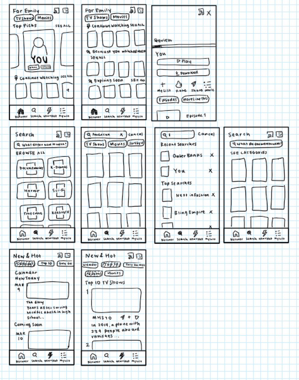
Brainstorming Additional Features and CompositionAfter constructing a new information architecture, we chose to focus on sketching our designs for Discover, Search, and the new My Lists feature. Each of us took one part of the navigation tab and drew what we envisioned for the redesign.
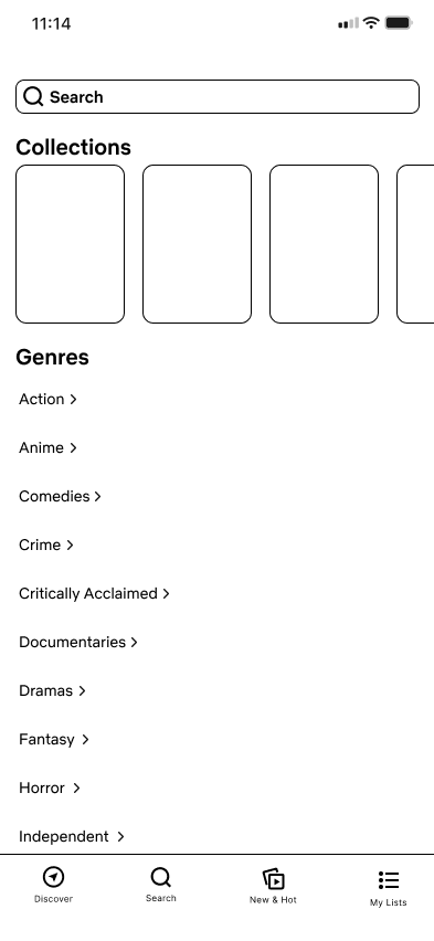
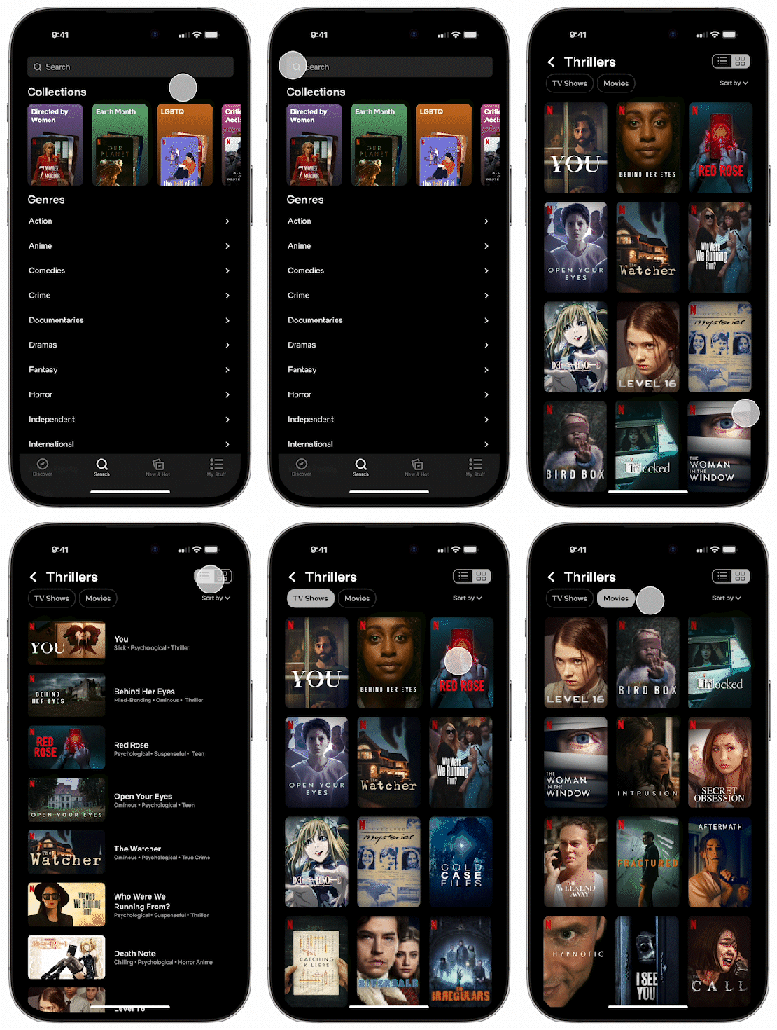
I sketched ideas for Search, enhancing discovery methods through collections, an accessible and comprehensive list of genres, and organizing content by sorting and offering grid and list views.
Discover
Search
My Lists
04
Design
Low-Fidelity Wireframes
Outlining New Features and OrganizationWith our finished sketches, we made our low-fidelity wireframes in order to properly visualize the app’s new design and figure out how our ideas would actually function. We designed basic screens for the new navigation tabs and some new features that we wanted to implement.
I transformed my sketches of Search into wireframes, and I designed the Profile which focused on adding a social aspect for more collaborative discovery methods.
Discover
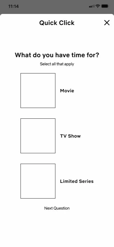
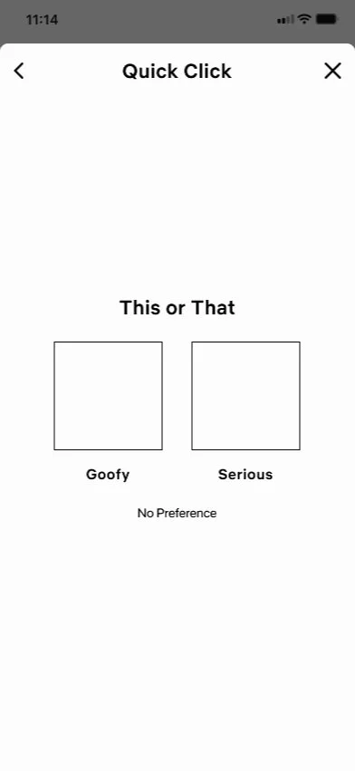
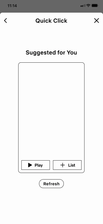
Quick Clicks
Search
My Lists
Profile
Reviews
Watch Party
High-Fidelity Prototypes
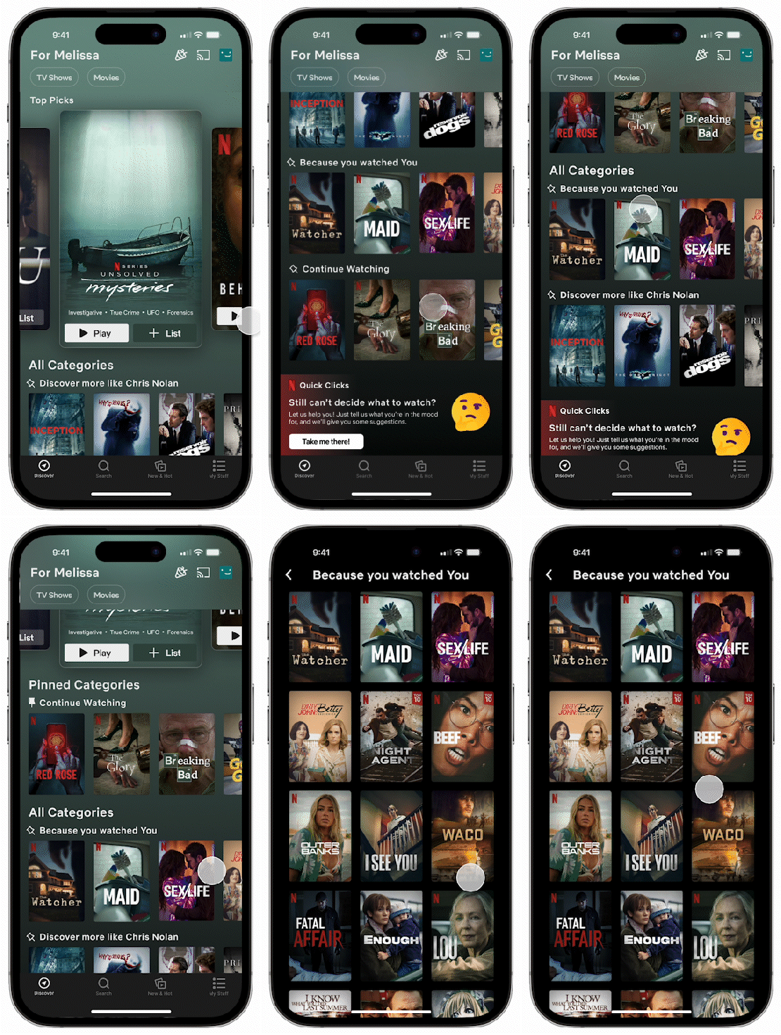
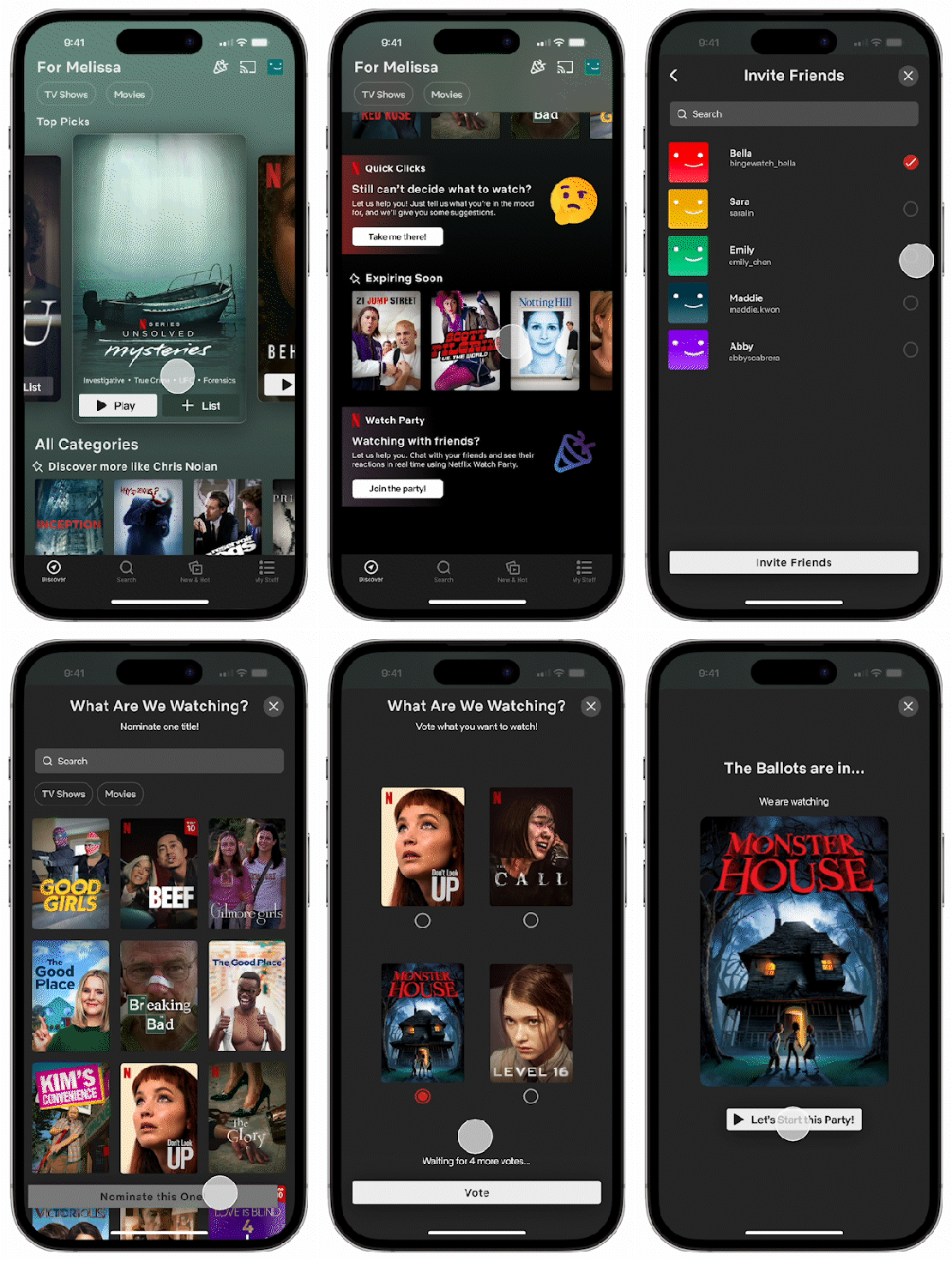
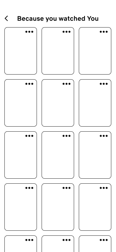
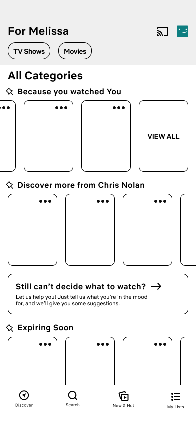
The Discover page now has the option to view all related content in a category.
Users are also able to pin categories to customize their browsing experience and minimize scrolling.
A/B testing revealed the ellipsis to bring users to quick actions to not be intuitive or useful.
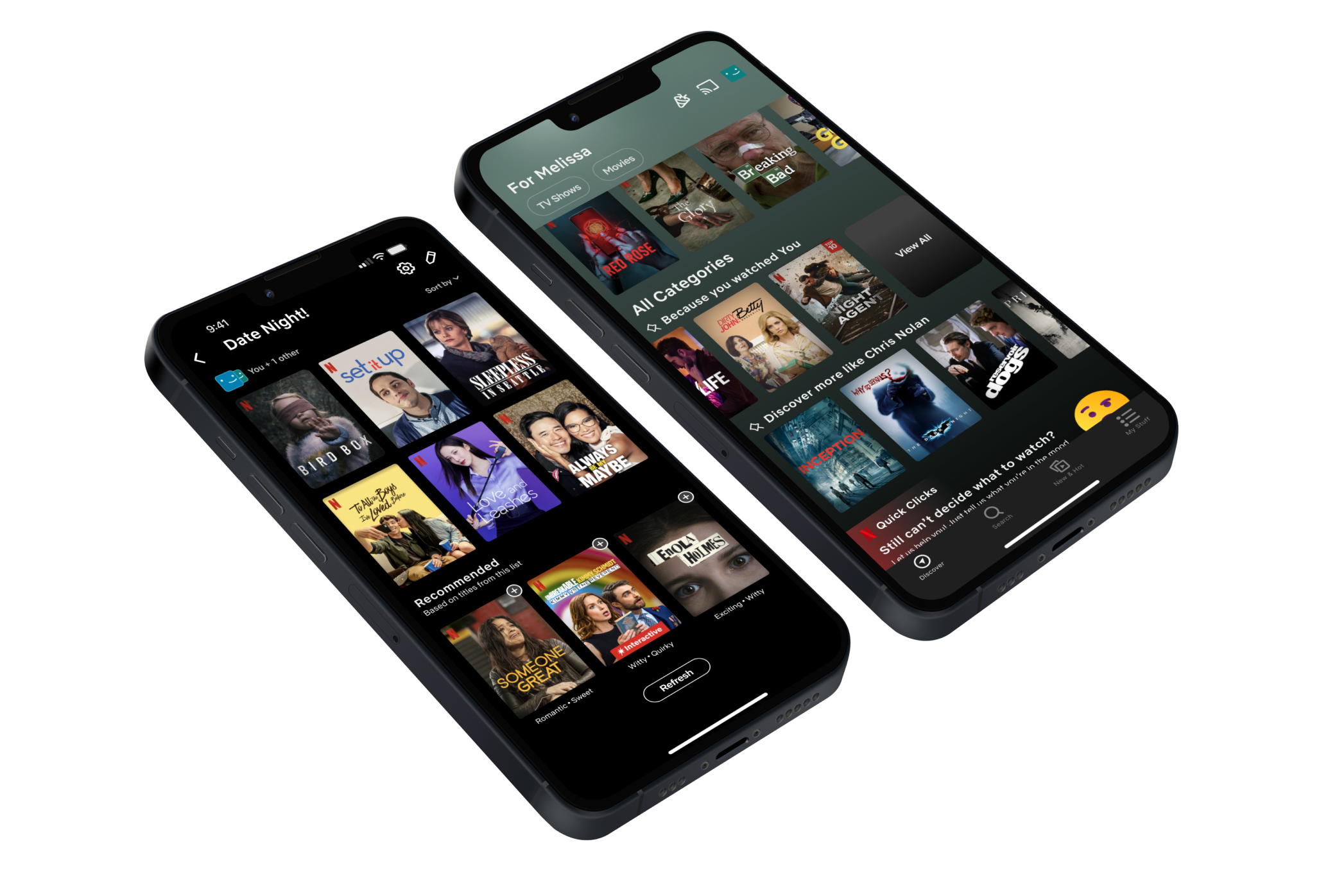
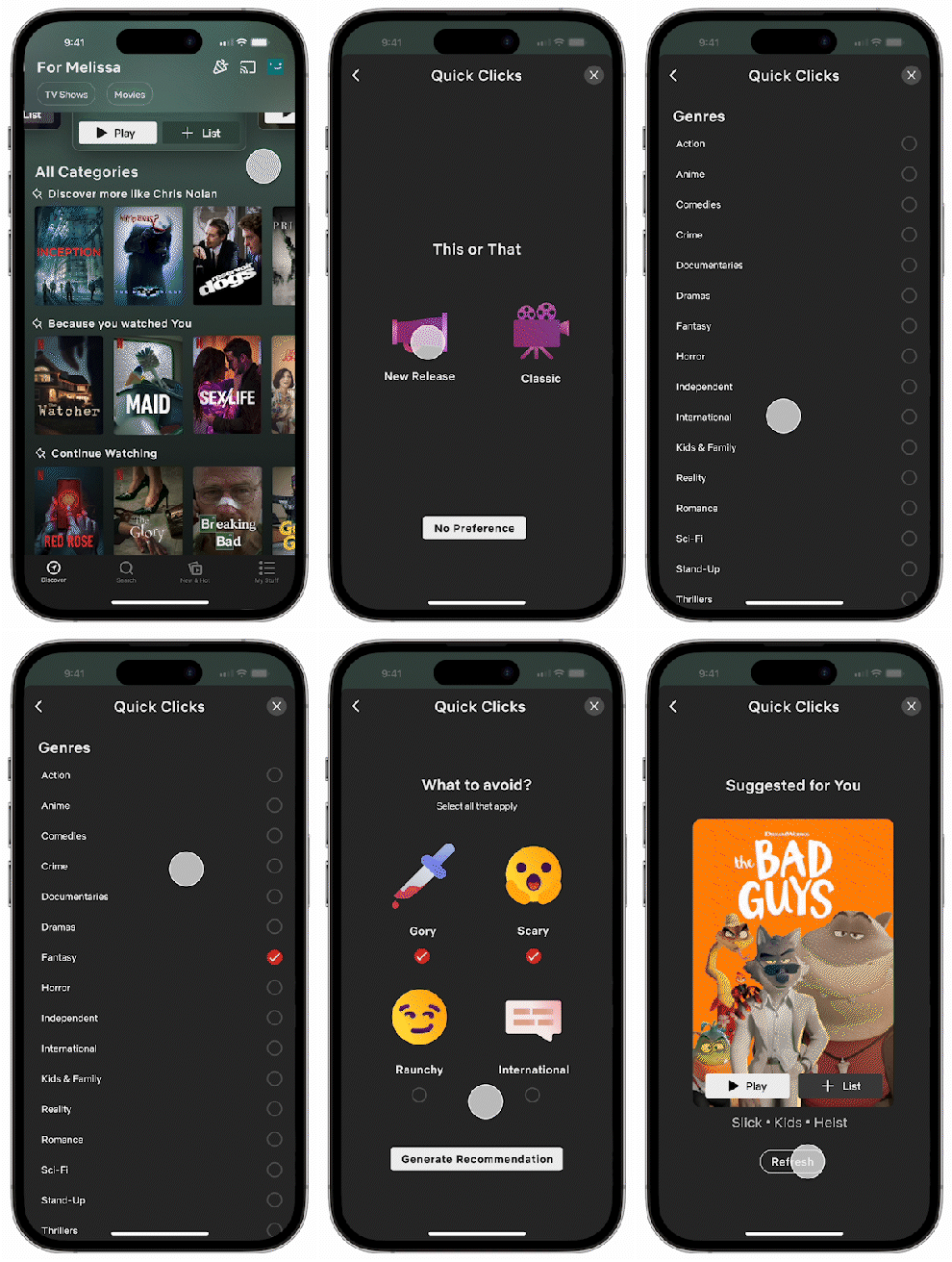
We added a new method of discovery accessible through the Discover page. Through a series of short questions, Netflix will generate singular personalized recommendations that can be refreshed to narrow down options and avoid being overwhelmed when scrolling.
The Search page now has more functionality with the ability to browse by genre and view collections that allow Netflix to feature content on different topics.
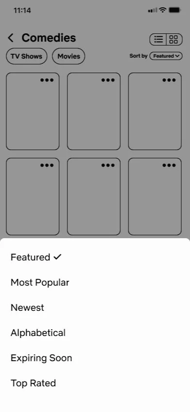
We also introduced the ability to view content in a list or grid and sort content by various methods.
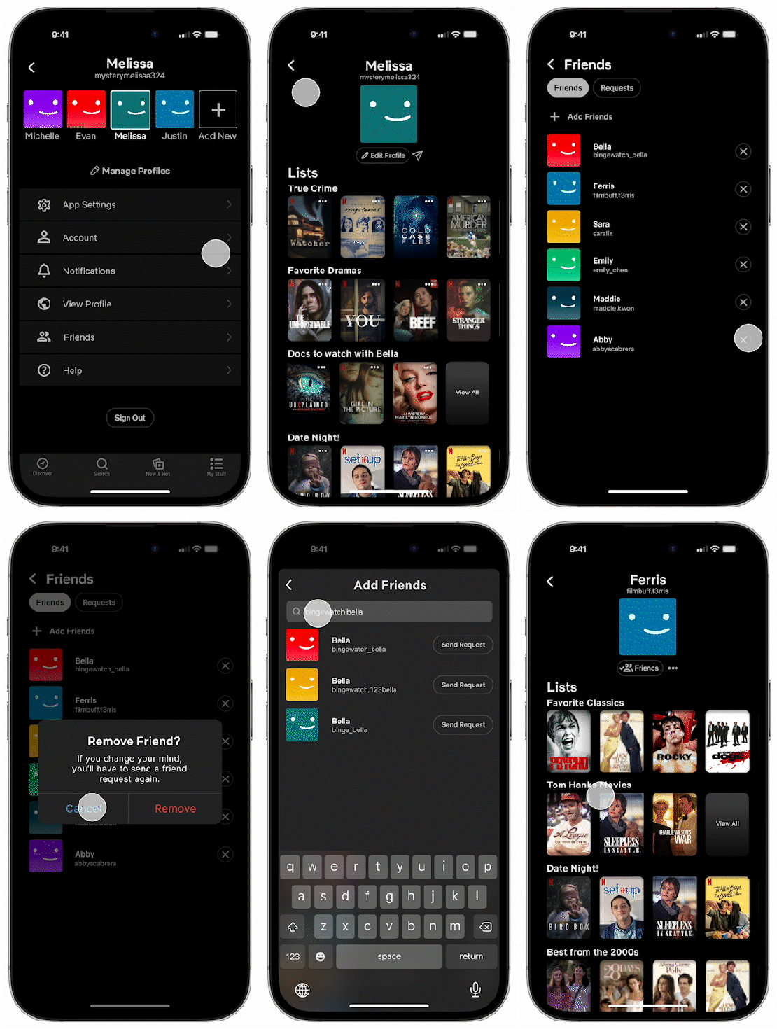
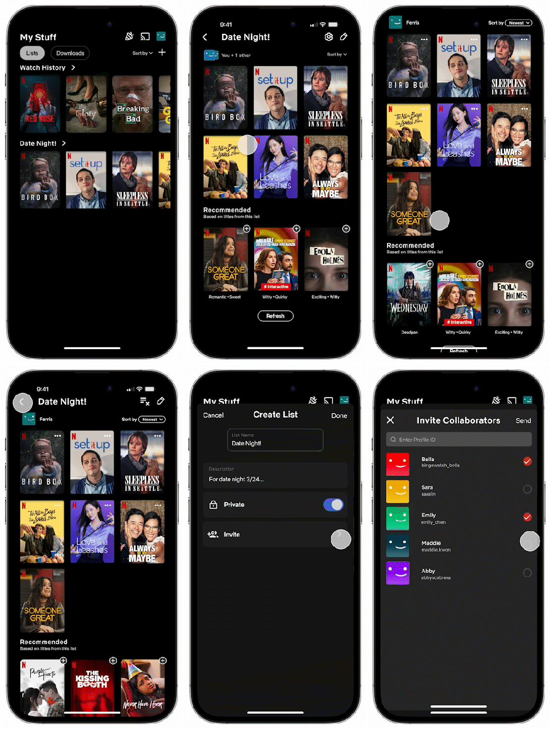
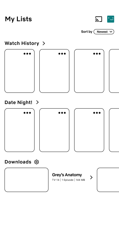
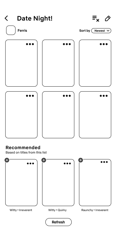
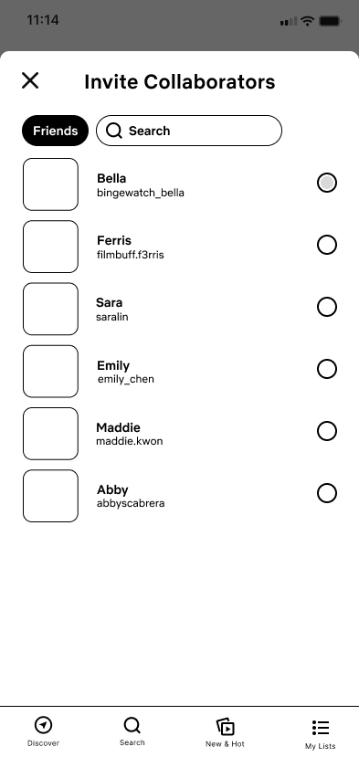
In the new lists feature, we implemented the ability to make multiple lists and invite collaborators.
Lists also come with recommended titles based on other content within the lists that can be quickly added.
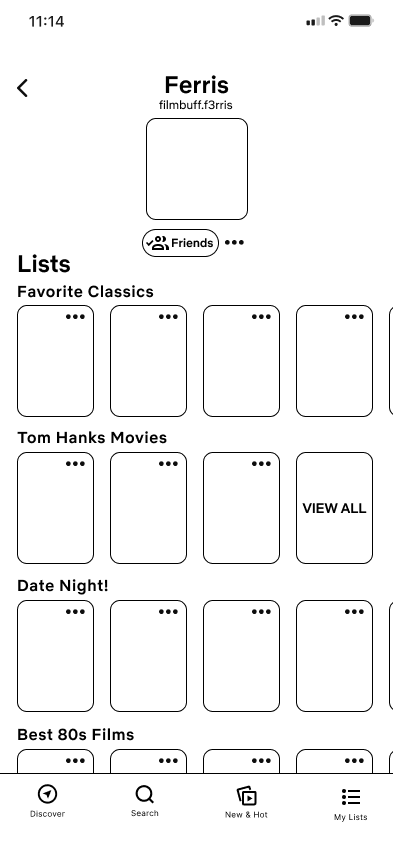
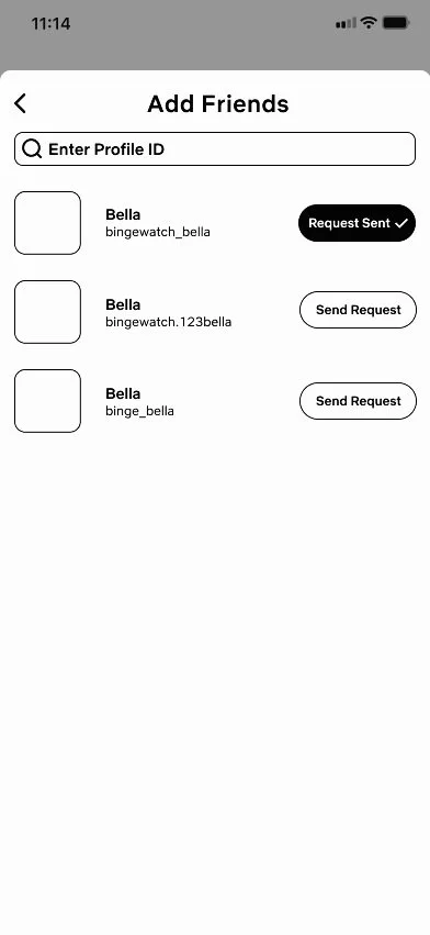
To incorporate more user-to-user interaction, we’ve added individual profile IDs to allow users to add friends and view public lists on a user’s profile.
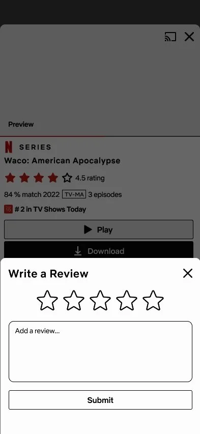
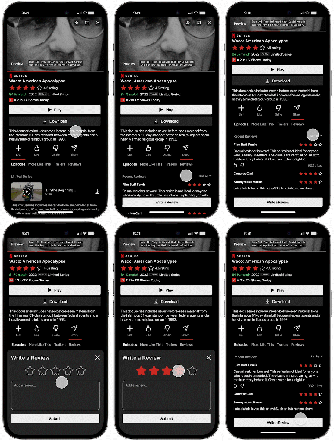
We also implemented reviews to support discussion of content within the app as well as a visible rating of audience opinion. This will aid the discovery process and add a community aspect that is usually found on other apps.
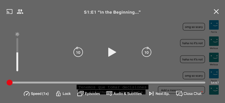
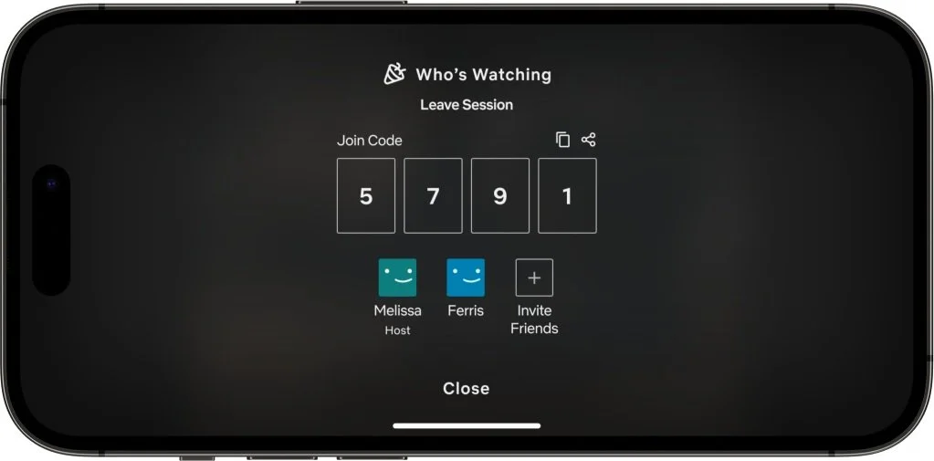
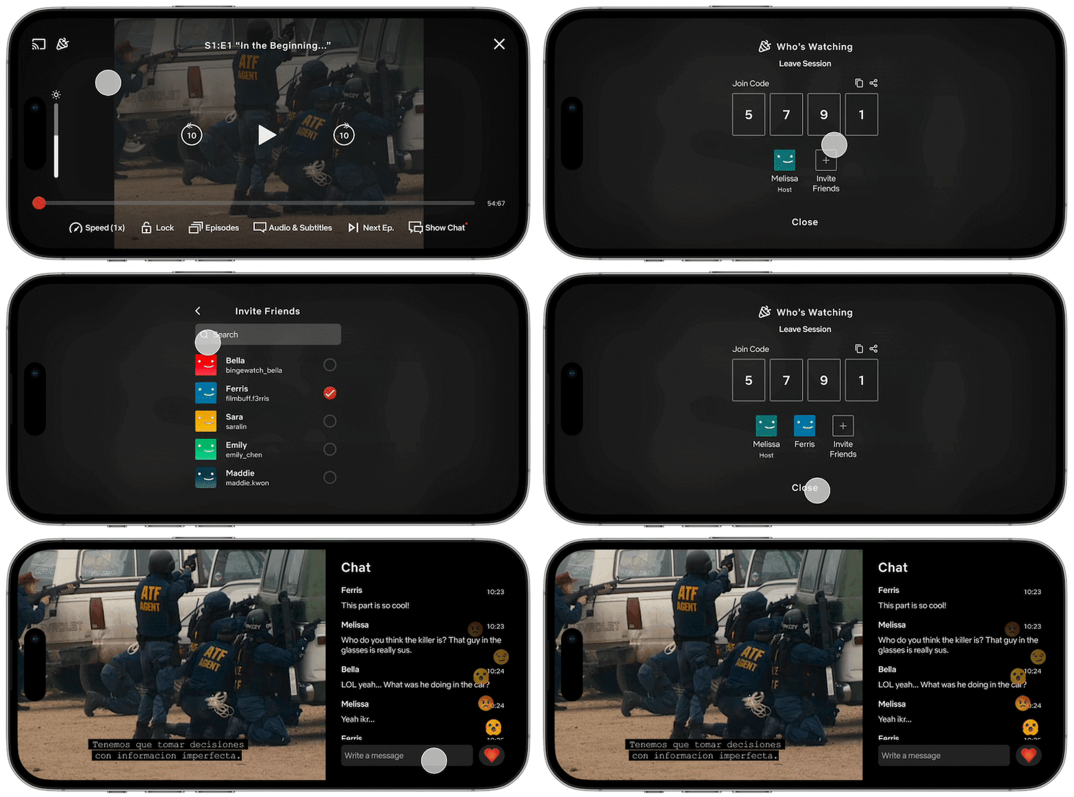
Users are also able to start watch parties to view content together across devices.
Watch parties can be started from the Discover page where users will then invite friends, choose a few viewing options, and vote on a title to watch.
Watch parties can also be started within a title in case there is no need for a voting process.
The new feature comes with a chat as well which can be shown and hidden at will for a more connected viewing experience.
05
Next Steps & Reflection
Next Steps
Addressing Concerns from Usability TestingWe performed some usability testing that gathered input from 10 users on each of our new screens and features. Testing revealed issues with reviews due to concerns of spoilers and preferences leaning towards a more simple star rating. Removing friends also seemed to cause difficulty for users with the button being hard to find or too easy to accidentally press. Our new Quick Clicks feature was well-received, but users wanted to see genres being included in a question. Some icons in the My Lists pages required clarification, and there were mixed opinions on whether watch parties should have a chat or simple emoji reactions.
Due to the timeline of the project, we were unable to perform more testing and develop our designs further based on this feedback. Given more time, we could redesign these struggles to be more intuitive despite the large changes we made to the app.
Takeaways
My Experience Completing My First UX Case StudyThis case study was my first time experiencing the entire UX process and designing in Figma. I learned a lot about the fundamentals of UX design, getting comfortable with a new design software, learning how to effectively conduct user research, and applying more intentionality to my designs. I learned to reframe the way I viewed the app to identify what could be improved, something I hadn’t quite done before this project. Over rounds of feedback, research, and discussion, I realized how detailed these design decisions are not only in how it fits in with the look of the app but how it enhances the functionality of a certain feature. Going into the more advanced design and prototype steps also helped me learn a lot about how to utilize more of Figma’s features to aid my designs in looking cleaner.
My team also served as such a helpful resource throughout the process. My teammates’ different perspectives expanded my idea of the design possibilities and approaches in the scope of this project. It also provided me experience with collaborative creative work, constantly discussing and combining our ideas to make sure our designs stayed cohesive.
